Binary Coffee Ordering App Design
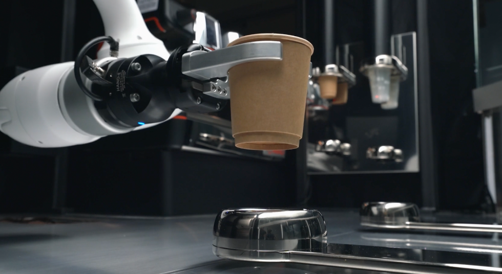
Binary Coffee is a fully autonomous coffee kiosk capable of emulating the brewing style of baristas at scale and with machine-like precision.
Project Objectives: Design a Coffee Ordering App for Binary Coffee Kiosks that delivers a positive, customer-centric experience for patrons buying and pre-ordering their drinks even in the absence of human touch. All the while aiming to enhance user’s knowledge and appreciation for quality coffee.
Business Goals
-
More drinks purchases
-
Speed to order and timely collection
-
Brand Binary Coffee as highly specialized coffee experts
-
Emulate an experience of ordering from a human barista
*Success Metrics (Data pending, to be added after the app has been launched)
My Role
UI Lead
Research, Wireframe, Prototype
Timeline
Probono Project of 3 Weeks, May 2021
Tools
Tools
Figma, Miro, Adobe Illustrator
Meet The Team


Everyone chose a specific position along with secondary roles to ensure every part of the project had focus and ample assistance when needed. As a result, we were able to work fast and diligently while staying updated with everyone's progress.
Process & Constrains
There were a number of features planned for the app but due the time constraint of 3 weeks, and this being their 1st app release, my team had to pinpoint the key features to focus on.
The Background.
The problem
With the increasing hustle of everyday life, it's a luxury if one is able to seek out and enjoy a cup of barista-brewed coffee in a specialty cafe. Especially now when physical interaction is less desirable due to Covid19, a robot can bring assurance. Binary Coffee wants to make specialty coffee accessible to everyone anywhere.
How can we make it easy for people to purchase quality coffee from Binary Coffee?
How can we help humanize Binary Coffee and make it stand out among the crowd of ordering apps?
The Discovery Phase.
What are players in the coffee industry doing?
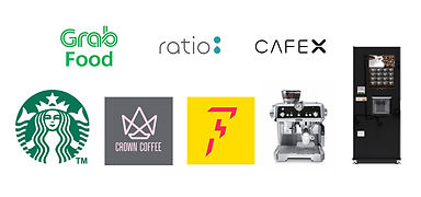
Scouting the competitive landscape
To understand Binary Coffee’s position within the competitive landscape, we looked into different players in the coffee industry.
We studied other Coffee Robots, Vending Machines, Coffee Cafes, and Homebrewed coffee. The idea was to extract the experiences these various platforms provided and dive deeper into why people use them.

Visting our direct competitor
We visited Ratio and Crown Coffee Ella, to understand how their drinks collection work in tandem with their apps
We wanted to conduct guerilla interviews at Ella with the morning crowd, but the mall was quite empty at that hour. Unfortunately, Ratio was a challenge too because it was a small cafe with attentive staff.
Challenge we face with guerilla interview
What are people's lifestyle towards coffee?
We interviewed 15 participants between the age of 15 to 58 years old who were coffee drinkers over Zoom. We wanted to discover more about their coffee drinking behaviors, distill their needs towards coffee, and identify any frustrations they face regarding coffee.
Interestingly, we had some contradictory findings. While half the group was particular about the quality, and want to know more about the coffee they drink, the other half was more concerned about grabbing a coffee within their convenience.
"I care a lot about the quality of the coffee."
"I want to know the origin, process and coffee profile."
"I don’t like to wait for my coffee."
"I have to pay more if I want to drink quality coffee"
Identifying key features for our solution
Lastly, we performed Heuristic Analysis along with Task Analysis and Plus & Delta on 7 Ordering Apps for coffee - Ratio, Ella, CafeX, Grabfood, Starbucks, and Flash Coffee. The reason was to use the industry’s best practices to inspire our App’s solution and identify design opportunities. Among all the features we noted down, we decided on 6 key points.
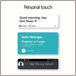
Personal touch
Answering back to emulating an experience with a human touch, we felt using the names of the users helps them connect to the app better.
Despite the contradictory findings, looking at a bigger picture, they were mainly different needs instead of conflicting mental models. Ultimately, they all need reliable information about their coffee orders so they are able to make a well-informed purchase and appreciate the coffee they want that is suited to their lifestyle.
After analyzing data from the interviews and affinity mapping, we were able to identify 3 personas based on their distinct behaviours and level of interest towards coffee.

Expert Ethan
Does in-depth research about coffee and is particular about the quality of coffee he drinks

Trendseeker Tina
Wants to know more about coffee and looks out for trendy drinks to post on social media or enjoy with her friends.

Busy Brandon
Needs caffeine-boost more than the coffee taste and thus finds affordable coffee that’s quick and convenient to his busy schedule.


Designing The Solution.
Ideating as a team
We conducted one take-home design studio by sketching our version of the whole app before meeting to discuss. This gave us more time to ideate the whole app with our proposed user flows. Upon meeting is when we studied each other's ideas, clarified the reason for the function/feature, and then combine all the best ideas into 1 set of final sketch and with 3 agreed proposed user flow.

Challenge we face with ideating
While we agreed on most features, we were stuck on a few, notably the homepage - should it be the full menu?
This dilemma resulted from the mental model users have towards ordering apps, how we influence their impression of the brand through this app, the number of steps in the flow, and that the decision affects the number of icons in the navigation bar. In the end, we chose a professional front with a humanized message to fit in our other features as well.

Major Features Design Decisions
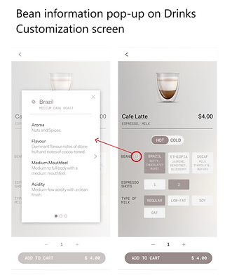
Coffee knowledge and education
With education being one of the major aspects of the app, we decided to dedicate space enough to compact information about beans. This feature allows users who are knowledgeable about coffee to better choose their preferred flavor. This set of information is also featured during collection to accompany the coffee beverage as tasting notes, an experience similar to one from a specialty cafe.

Timely order and collection
The idea was to make ordering and collection so simple, users wouldn't have to think of alternate solutions e.g nearby cafes or coffee stores. This meant 3 things:
1. Default options also act as recommendations.
For users who prefer the authentic coffee taste, or for users who want to know how to best enjoy their coffee. Big buttons were used to increase the hit area, while the 'i' button is tucked at the side to prevent clutter.


2. Coffee can be ordered instantly in advance.
Placed on the homepage for instant access, the app is able to offer users a quick re-order of their most frequently bought drink. A customer-centric experience one would have with a human barista who knows them well.
We made sure to check with the client and his IT team that this technical feature could be implemented.
3. Make collecting coffee a quick take-and-go.
On top of choosing a collection timing, the real-time progress screen shows users which stages their drink is in to give them a better estimate of their time for the coffee pick up.
As the app was to be designed on iOS, the scroll wheel for timing was inspired from there to keep design consistent.

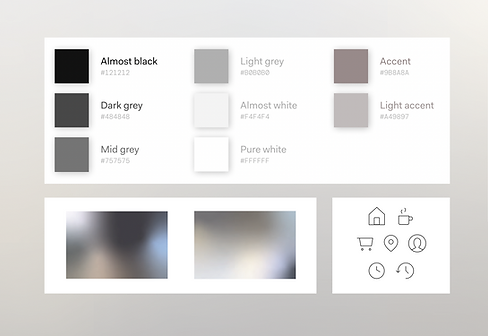
Our Design System
Based on the brand guidelines of Binary Coffee, there were three primary brand colors, and we used complementing variations of it to achieve visual hierarchy in the design. Adding on with the sleek icons, we wanted to portray the overall impression of simplicity and professionalism.

.png)
Color Accessibility
When we were considering the final colour palette, we ran an evaluation on its accessibility to ensure the app is also usable for user groups who may face different forms of colour blindness. As seen below, they’ll still be able to tell apart the unselected and selected states of the buttons.
.png)

Testing Our Solution.
Setting our usability test parameters
We conducted 3 usability tests with 5 participants each. While all the test could run on both mobile and computer prototype, we set the 2nd test to only be done in person via mobile because we felt it would bring out the most authentic experience and feedback for us and the participants.
Objective:
-
Gain insights into user behaviour for drink orders
-
Investigate user’s perception towards the coffee knowledge incorporated
-
Identify any possible confusion or obstacles in coffee purchase or discovery
Positive Findings
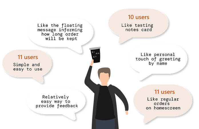

5/5 users completed the flow with less than 2 errors on the Final Test
"I'm impressed, you ladies really brought out some points that our team, even after working on this for a year, never thought of."
- Shawn, Every Matter
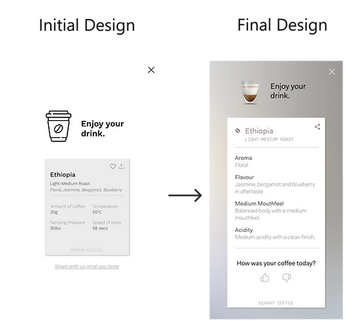
Usability Issue #1: Users could not understand the tasting notes
Drinks Collection Screen
Help users to instantly re-access relevant information
While 4 out of 5 users appreciated the tasting notes and felt it was educational, they also did not quite understand the information inside because it was too technical. The information was also too specific to the brewing method of Binary Coffee's machine, thus we decided to repeat the same bean information card on the drinks customization page. This way, users are able to immediately relate back to the drink they chose.
Final Solution: Repeat the bean information card as tasting notes
Usability Issue #2: Users were confused during order tracking and collection
Order Collection Screen
Provide instructions to help ascertain users on their next action
5 out of 10 Users were not confident about the action required on their end regarding the QR Code and some were confused about the timing, thinking that it was the time they ordered the drink. We had to stop the confusion so users can collect the drinks they bought at the right time.
Final solution: Added collection instructions and title "Collection details"

Usability Issue #3: Users want assurance on their pre-order
Upcoming orders screen
Where and how long to leave on a fine print
3 out of 5 users wanted to know how long their drinks will be held. While we added a fine print of '10 minutes holding time' on their mobile push notification, users missed it so we added a microcopy on the upcoming orders screen. This information on buffer duration helps assure users who are still on the way and also subtly caution them to collect their drinks within the set time. We decided to use a floating message for the 'reminder' fine-print to prevent cluttering the interface - especially after repeated use.
Final Solution: Use a floating message (that allows users to manually close it after they are aware.)

My Reflections.
Balancing Business Goals and User Needs
Users wanted to be able to cancel their pre-orders but while giving them an easy way to do so might meet their needs, this would not be the most desirable for Binary Coffee. Thus, we had to strategically place the 'cancel button' at the right place within a specific timeframe. Doing so will still give users the option to cancel but at a reduced rate for the business.
Users exhibit different behavior executing same task
Users have different ways of achieving their goals. For instance, some users would change location at the home screen while others would edit it from the checkout screen. Thus, we learn that it is good to provide more than one point of entry to provide user’s more flexibility.
Users are driven by incentive to do extra steps
During the usability test, users shared that they would only create an account if there was a membership/loyalty program or if they frequent Binary Coffee regularly. Meanwhile, leaving feedback was not in their nature unless the coffee was exceptionally good or they faced a terrible experience.